My Bui (Mimi)
Data Engineer & DataOps
My LinkedIn
My GitHub
The data set was compiled by Kaggle for their introductory data science competition, called Titanic: Machine Learning from Disaster. The goal of the competition is to build machine learning models that can predict if a passenger survives from their attributes.
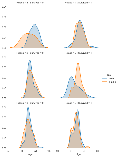
We’ll use the conditional ploting technique to explore a small multiple, which shows the differences in age and gender distributions between passengers who survived, and those who didn’t by creating a pair of kernel density plots.
Here are descriptions for each of the columns in train.csv:
- PassengerId – A numerical id assigned to each passenger.
- Survived – Whether the passenger survived (1), or didn’t (0).
- Pclass – The class the passenger was in.
- Name – the name of the passenger.
- Sex – The gender of the passenger – male or female.
- Age – The age of the passenger. Fractional.
- SibSp – The number of siblings and spouses the passenger had on board.
- Parch – The number of parents and children the passenger had on board.
- Ticket – The ticket number of the passenger.
- Fare – How much the passenger paid for the ticket.
- Cabin – Which cabin the passenger was in.
- Embarked – Where the passenger boarded the Titanic.
import pandas as pd
import matplotlib.pyplot as plt
import seaborn as sns
titanic = pd.read_csv('titanic/train.csv')
cols = ['Survived', 'Pclass', 'Sex', 'Age', 'SibSp', 'Parch', 'Fare', 'Embarked']
titanic = titanic[cols].dropna()
titanic
| Survived | Pclass | Sex | Age | SibSp | Parch | Fare | Embarked | |
|---|---|---|---|---|---|---|---|---|
| 0 | 0 | 3 | male | 22.0 | 1 | 0 | 7.2500 | S |
| 1 | 1 | 1 | female | 38.0 | 1 | 0 | 71.2833 | C |
| 2 | 1 | 3 | female | 26.0 | 0 | 0 | 7.9250 | S |
| 3 | 1 | 1 | female | 35.0 | 1 | 0 | 53.1000 | S |
| 4 | 0 | 3 | male | 35.0 | 0 | 0 | 8.0500 | S |
| ... | ... | ... | ... | ... | ... | ... | ... | ... |
| 885 | 0 | 3 | female | 39.0 | 0 | 5 | 29.1250 | Q |
| 886 | 0 | 2 | male | 27.0 | 0 | 0 | 13.0000 | S |
| 887 | 1 | 1 | female | 19.0 | 0 | 0 | 30.0000 | S |
| 889 | 1 | 1 | male | 26.0 | 0 | 0 | 30.0000 | C |
| 890 | 0 | 3 | male | 32.0 | 0 | 0 | 7.7500 | Q |
712 rows × 8 columns
g = sns.FacetGrid(titanic, col="Survived", row="Pclass", hue='Sex', size=3)
g.map(sns.kdeplot, "Age", shade=True)
g.add_legend()
sns.despine(left=True, bottom=True)
plt.show()